
(please click to enlarge)


I always notice how sunlight affects a flower near the window. The flower leans towards whichever direction the light is. But I haven’t ever thought that light could affect people like that too. The article by O’Connor, The Claim: Daylight Saving Time Can Affect Your Health, enlightened me on a subject that I was uneducated about. Daylight savings time is something exciting every October because I get an extra hour of sleep that night! The fact that this could be dangerous to my health is scary. I haven’t noticed any sleep disruptions or problems with my internal clock. But I can see how your body and its circadian, rhythm could be affected by this and potentially be dangerous.
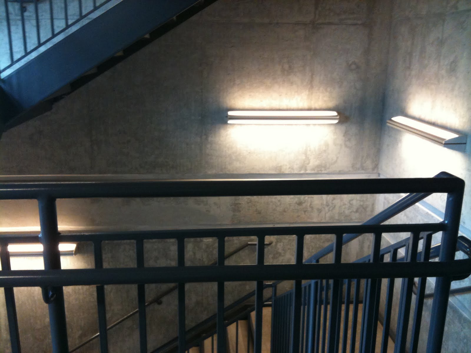
Influence of Architectural Lighting on Health, by Eve Edelstein is another topic that was new to me. Seasonal Affective Disorder (SAD) is a condition involving prolonged exposure to inadequate levels of daylight (Edelstein, 2). This can cause dysfunction in a person’s immune and endocrine systems, and even cancer. Edelstein discusses the studies done of night shift nurses, factory workers and flight crew. Because of their almost constant exposure to electric and solar light, studies show increased cancer rates. Circadian rhythm is a body’s internal clock. Cardiac function responds to it and electric light almost instantly. Meaning daily heart rate patterns can also change under different environmental conditions (Edelstein, 2). These findings are all of importance to designers and other professionals because they could help to eliminate some of these problems that may be controllable.
“Our experience of light begins in the personal and proceeds to the universal” (Millet, 1). Light is something that has always been around me since I was born. It’s not something that the average person may necessarily think much about because it is always there when we want it and not, when we don’t. But when you do think about it, light affects everything. Light is what makes color, color. Its what makes objects and life seem real. In an article by Marietta Millet, Light Revealing Experience, she discusses the relationships between light and place, nature, climate, time, and task. Through reading this article, I am able to relate all of these topics to my own life and experiences.
There’s nothing quite like being on a boat in the middle of Lake Norman watching the sunset over the water. All the rich colors are seen in a reflection that I can touch with my hands. Light has the ability to identify places by their physical characteristics (Millet, 6). Not just a view, but the way light hits a building or sculpture. I can recognize where I am by seeing the shadows coming from my mailbox or the way light comes in through the different windows in my house. Every place is defined uniquely by the light combinations involved (Millet, 6). I think back to my visit to Fallingwater in my first year of Interior Architecture. There was a walkway that had a covering that produced a bold pattern of vertical lines cascading through the path. Frank Lloyd Wright is one of those skilled architects that I have seen use light in such a way that brings everything together – inside and out. Even the way light is shown throughout that home is a sight to see and remember.
Light can suggest other places that we see in nature. For example, the shadows from the walkway at Fallingwater are wide and vertical on a stone wall. It hints at the trees surrounding and brings the structure back around to reflect nature. All characteristics of light can together create a visual connotation that can remind us of something in nature that we have seen before or might perhaps be distant (Millet, 15)
The interaction between light and climate is multidimensional, having to do with place, thermal comfort, culture, peoples’ habits and rituals (Millet, 17). Depending on the temperature of a place or the way light is reacting to that place and climate can make a person have a change of emotions. As Millet stated, a winter day where there is snow on the ground can make a person feel happier than if there wasn’t snow because of the high amount of light reflecting off the white snow. I lived in Ohio for 16 years. There were plenty of days in the year where we had snow. There were also plenty of days with dead grass. I would pick that snowy day over any of those other gloomy days every time. The snow put me in a cheerful mood when there was any bit of sunlight shining down. It just makes me happier when it’s bright out.
Light also has an effect on time. In other countries like Egypt and England, they have been able to use means of telling time such as the pyramids and Stonehenge. Though in America, we seem rather fixed on the clock. What people may not think of is that we also tell time by the seasons and the amount of light coming in through a window. We can tell that it is morning because there is light coming in from a window facing east. We know that it is summer because the day is light for a longer time. While we can tell these time points by light, I do think than many people rely on electric light more than we should. It could be dark outside and I may not know it because I have lights on in my house. It is important to experience and experiment with all types of light sources, day and night.
We are most aware of light when there is either not enough or too much, to be able to comfortably do what we want (Millet, 26). I think Frank Lloyd Wright had a great idea for maximum task light in the Larkin Building by incorporating a large skylight and perimeter windows. This created diffused lighting from every direction and people could work at a desk without any shadows cast (Millet, 26). I prefer to have the use of natural light during the day and also electric light at night if needed for tasks. Having options is helpful when I need maximum light I could always turn on a bright desk lamp to do work by or an overall ceiling lamp.
Overall, it is clear that light relates to everything in our world. Whether we are with it or without it, light affects everything.
I set goals for myself at the beginning of the semester and have achieved most in one way or another I hoped to challenge myself and explore different ways of going about my own style. I think I have achieved this, I tested my limits and learned how far I will go to get to the results I wanted. Better expressing my thoughts and designs is another that I have made progress with. I started sketching more for ideas in the beginning of my design process. This came out most in the group of twelve when I had done about fifty small sketches of possible overall looks of our building. This helped my group members visualize our opportunities. This semester I learned Podium. While hard at first, I have gotten the hang of it and can do digital renderings that look great. In the coming semesters, I want to further my knowledge of digital rendering and be able to successfully intertwine digital with hand renderings. I also was forced to collaborate with peers as we were in groups for a large portion of the semester. I learned that getting my ideas voiced is highly positive with the addition of my peers ideas. I have slightly narrowed my focus. Right now I have a strong interest in residential design. I have enjoyed designing spaces that people live in this semester.
I think one of the biggest things I have learned this semester is our theme, whole is greater than the sum of its parts. What this means to me is that every little detail is important and is stronger when it is placed with the rest of the parts. This course has forced me to focus on these smaller details as well as the whole. Just as working alone as compared to being in a group of 3, 6, and 12; the design in a group of 12 being composed of all different people’s ideas can be very strong.
I loved working alone because it gave me the opportunity to actually do all the work and get practice at the technical drawings, perspectives, diagrams, and more. This semester is the first time that I have really been submerged into groups of such large projects. I wasn’t too fond of the idea of other people doing work that I was used to doing at first. But I realized that it is really helpful to have group members to collaborate with and help with the workload. I didn’t really like the small group of 3 because if one person was having an off day then the other two were left to take on the design production. The group of 6 was probably my favorite. There was enough people to really bounce ideas around and get a well-polished design, but not too many. The group of 12 had its ups and downs. While always having an idea there to consider, with so many different personalities and design styles involved it was difficult to come up with a final decision with everyone being pleased.
Writing has been a very helpful tool for the organization of a design. Working alone, I did many narratives of my designs that helped get my idea across. But in the larger groups, there were prospectuses, which I found the most helpful. These completely broke down our design as well as our group. At the beginning of a project, the prospectus helped to learn my group members in order to assign everyone’s strengths. It documented diagrams and notes throughout and in the end in a way that joined everything together. I think writing can really help a design process because of this sense of organization. This writing can be equally successful formally like a prospectus or informally in blog form.
My strengths this semester I believe have increased, formerly I included strength in graphic design, digital software, and being able to cooperate with others. I have vastly improved in model making skills. I have worked more with the laser cutter as well as hand created models. I gave a presentation about craft, which helped me realize that I do know a lot about having good craft, and hope that it shows through my work.

Some sketches from Jenga 7.0 group of twelve building design.


On Tuesday, I had the opportunity to attend the first year studio’s final critiques in the lobby. I enjoyed seeing all their projects and the progress they have made this past year. I didn’t know exactly what the assignment was but from what I could tell, they had to design a writing center within a historic building. One student’s project that really stood out to me was Sarah Wisseman (her blog can be found here). I found that her presentation was engaging and could tell she was passionate about design. Her key features in this building were that she wanted the space to overall be functional. She designed a space for conferences, gatherings, and even a greenhouse tower. This turret idea is what stood out about her presentation. She really took a risk on it which shows she had confidence in herself and her ideas. The circular tower had a huge contrast being located within a very rectilinear building. Sarah said she wanted this contrast so the tower could be like an oasis, or escape from the rest of the space. Being a historic house, it may be unlikely to get this tower inspection passed with it having an effect on the physical appearance of the house. But as Claire said, if she can sell the idea, and prove how it could fit in to the surrounding context of the house, then it could get passed. Overall, I was very impressed with Sarah’s presentation and the way she used her technical drawings, perspectives, and speech to get her design across.


