Tuesday, December 1, 2009

Final Luminescence Model


This is my final model of the Luminescence project. I decided to make it bigger than the first few models. I also changed the fabric to a brighter pinkish red. This made the glow more bright and colored. It also made it look more aesthetically pleasing in natural light.

My concept and idea behind this was the way a flower looks when the sunlight is shining through it. You can see all the different layers and petals of the flower. Just like my light, you can see many different layers of the fabric draped around the light source.


Monday, November 9, 2009

Luminescence Progression

1) My original thoughts were to experiment with shadows, but as I started playing around with materials, I decided I liked the concept of glowing light. I used a pale pink sheer fabric wrapped around the light which casted a pretty pink glow and turned the fabric bright pinkish-red when the light was on. Now I just have to figure out how to incorporate other materials!


2) After experimenting with the fabric around the light bulb, i thought it might get too hot in the inside and impractical. I still needed a couple more materials so i started thinking about what i could use to protect the fabric from getting too hot. I went to Lowe's and found this clear, plastic pipe that was just the right size to fit my lightbulb. Conveniently, it will also provide structure and a "backbone" to keep it standing up, like intended.


Thursday, November 5, 2009

Luminescence: Observations

FLOWERS IN THE SUN
http://farm1.static.flickr.com/70/167948326_b0c31fabee.jpg

http://images-3.redbubble.net/img/art/backingcolor:white/product:greeting-card/view:preview/2328348-3-red-rose.jpg

http://farm3.static.flickr.com/2040/2230250933_67966014be_o.jpg

GLOW
http://gallery.photo.net/photo/5478114-lg.jpg


GLOW
http://www.community-credit.com/images/prizes/glow_brick_blue.jpg

MOONLIGHT
http://thatwoman.files.wordpress.com/2009/06/moonlight.jpg

SUNSET
http://blogs.reuters.com/yourtake/files/2008/07/sunset.jpg

SUNRISE
http://farm2.static.flickr.com/1338/691515009_c112b9c230.jpg


http://www.link-design.org/2008/10/honey-comb_light_02.html


SHADOWS
http://www.denisejaunsem.com/show-image/244707/Denise-Jaunsem/Road-of-Shadow-and-Light.jpg

UPLIGHT
http://www.ledtealights.net/assets/images/led-uplight.jpg

http://farm4.static.flickr.com/3074/2317060736_957436f135.jpg

http://www.osram-os.com/osram_os/EN/News_Center/Spotlights/Success_Stories/_img/2009/E-Static_Shadows_1.jpg

http://digital-photography-school.com/wp-content/uploads/2008/12/light.jpg

SHADOWS
http://staytondailyphoto.com/photos/bridge_light_shadows.jpg

Friday, October 30, 2009

Comparing Dialog

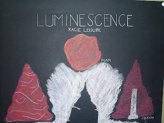
Instead of a typical critique at the end of this project, we did something a little different. Everyone laid out their projects on a table and each person had to pick 2 to compare and contrast. I was really surprised at how similar and different some of these projects were. The two that stood out to me right away were Dajana's and Kara's.

Dajana's model was one of my favorites. At first glance, it reminded me of a fan. The cards were curved in a spiral with the skewers inside it, mimicking the same spiral look and appeared like they were floating. Kara's project seemed to be all about curves and the idea of covering. There is a curved wall of the bristol cards that covers the skewers which are curved the opposite way of the cards, facing each other.

They are similar in that the skewers in each project are free standing. The cards in each are independent without the use of the skewers. They also both have to do with the idea of curvilinear lines. Both bases are circular. One of the main difference I noticed was the different idea of spaces in each. In Dajana's, there is mainly one structure piece, the spiral unit with the cards and skewers together. The two spaces seem to be apparent inside the spiral. In Kara's it is more clear that there are two spaces. underneath the skewers is one and between the skewers and cards is another.

Thursday, October 29, 2009

Junk Drawer Shadow Boxes

Dialog Drawings


PLAN

FRONT ELEVATION

RIGHT ELEVATION

SECTION ELEVATION

Friday, October 23, 2009

Dialog


The assignment: Using 12 bamboo rods and 12 Bristol Board cards (4" x 6" and only one fold allowed), create two distinct spaces that relate to one another in a mutually supportive way. In seeking this dialog, explore dualities of solid and void, front and back, in and out, orthogonal and diagonal, etc. Let the construction vocabulary reinforce and articulate your ideas about form.

My initial idea was to explore the dialog between reality and appearance. I knew i wanted to create a long strand of the Bristol cards and make them into a figure 8 shape to give it the unity of being connected but still with 2 main parts.

FIRST IDEATION
This didn't work for me because I thought I made the folds too big. This created little "spaces" within the big space on the left of the structure. I thought it would help if I redid it and made the folds smaller. I also needed to change the base, this one was only temporary.


FINAL IDEATION


Wednesday, October 14, 2009

Sketch assignment #5


The assignment was to draw 5 interior spaces with people.


Unity Drawings

Final

Before Lettering


Front Elevation

Perspective View

Right Elevation

Plan


Collage