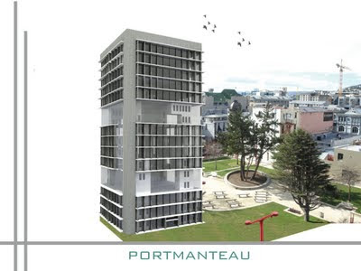
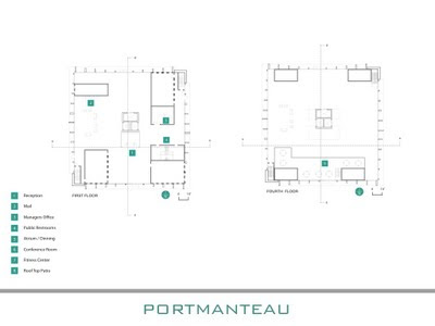
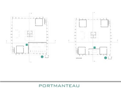
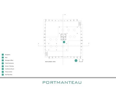
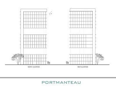
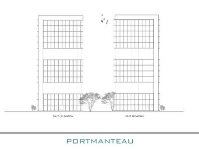
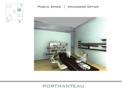
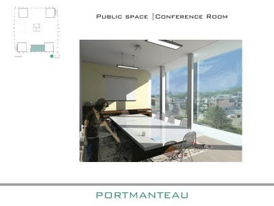
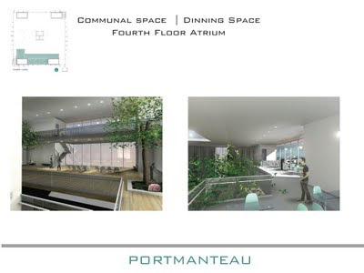
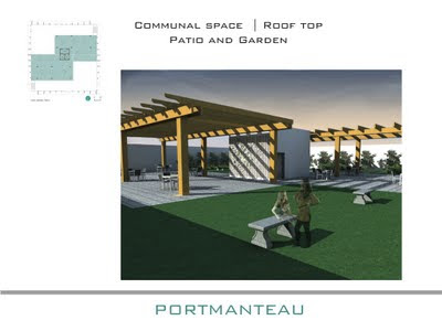
I set goals for myself at the beginning of the semester and have achieved most in one way or another I hoped to challenge myself and explore different ways of going about my own style. I think I have achieved this, I tested my limits and learned how far I will go to get to the results I wanted. Better expressing my thoughts and designs is another that I have made progress with. I started sketching more for ideas in the beginning of my design process. This came out most in the group of twelve when I had done about fifty small sketches of possible overall looks of our building. This helped my group members visualize our opportunities. This semester I learned Podium. While hard at first, I have gotten the hang of it and can do digital renderings that look great. In the coming semesters, I want to further my knowledge of digital rendering and be able to successfully intertwine digital with hand renderings. I also was forced to collaborate with peers as we were in groups for a large portion of the semester. I learned that getting my ideas voiced is highly positive with the addition of my peers ideas. I have slightly narrowed my focus. Right now I have a strong interest in residential design. I have enjoyed designing spaces that people live in this semester.
I think one of the biggest things I have learned this semester is our theme, whole is greater than the sum of its parts. What this means to me is that every little detail is important and is stronger when it is placed with the rest of the parts. This course has forced me to focus on these smaller details as well as the whole. Just as working alone as compared to being in a group of 3, 6, and 12; the design in a group of 12 being composed of all different people’s ideas can be very strong.
I loved working alone because it gave me the opportunity to actually do all the work and get practice at the technical drawings, perspectives, diagrams, and more. This semester is the first time that I have really been submerged into groups of such large projects. I wasn’t too fond of the idea of other people doing work that I was used to doing at first. But I realized that it is really helpful to have group members to collaborate with and help with the workload. I didn’t really like the small group of 3 because if one person was having an off day then the other two were left to take on the design production. The group of 6 was probably my favorite. There was enough people to really bounce ideas around and get a well-polished design, but not too many. The group of 12 had its ups and downs. While always having an idea there to consider, with so many different personalities and design styles involved it was difficult to come up with a final decision with everyone being pleased.
Writing has been a very helpful tool for the organization of a design. Working alone, I did many narratives of my designs that helped get my idea across. But in the larger groups, there were prospectuses, which I found the most helpful. These completely broke down our design as well as our group. At the beginning of a project, the prospectus helped to learn my group members in order to assign everyone’s strengths. It documented diagrams and notes throughout and in the end in a way that joined everything together. I think writing can really help a design process because of this sense of organization. This writing can be equally successful formally like a prospectus or informally in blog form.
My strengths this semester I believe have increased, formerly I included strength in graphic design, digital software, and being able to cooperate with others. I have vastly improved in model making skills. I have worked more with the laser cutter as well as hand created models. I gave a presentation about craft, which helped me realize that I do know a lot about having good craft, and hope that it shows through my work.

Some sketches from Jenga 7.0 group of twelve building design.


On Tuesday, I had the opportunity to attend the first year studio’s final critiques in the lobby. I enjoyed seeing all their projects and the progress they have made this past year. I didn’t know exactly what the assignment was but from what I could tell, they had to design a writing center within a historic building. One student’s project that really stood out to me was Sarah Wisseman (her blog can be found here). I found that her presentation was engaging and could tell she was passionate about design. Her key features in this building were that she wanted the space to overall be functional. She designed a space for conferences, gatherings, and even a greenhouse tower. This turret idea is what stood out about her presentation. She really took a risk on it which shows she had confidence in herself and her ideas. The circular tower had a huge contrast being located within a very rectilinear building. Sarah said she wanted this contrast so the tower could be like an oasis, or escape from the rest of the space. Being a historic house, it may be unlikely to get this tower inspection passed with it having an effect on the physical appearance of the house. But as Claire said, if she can sell the idea, and prove how it could fit in to the surrounding context of the house, then it could get passed. Overall, I was very impressed with Sarah’s presentation and the way she used her technical drawings, perspectives, and speech to get her design across.


